
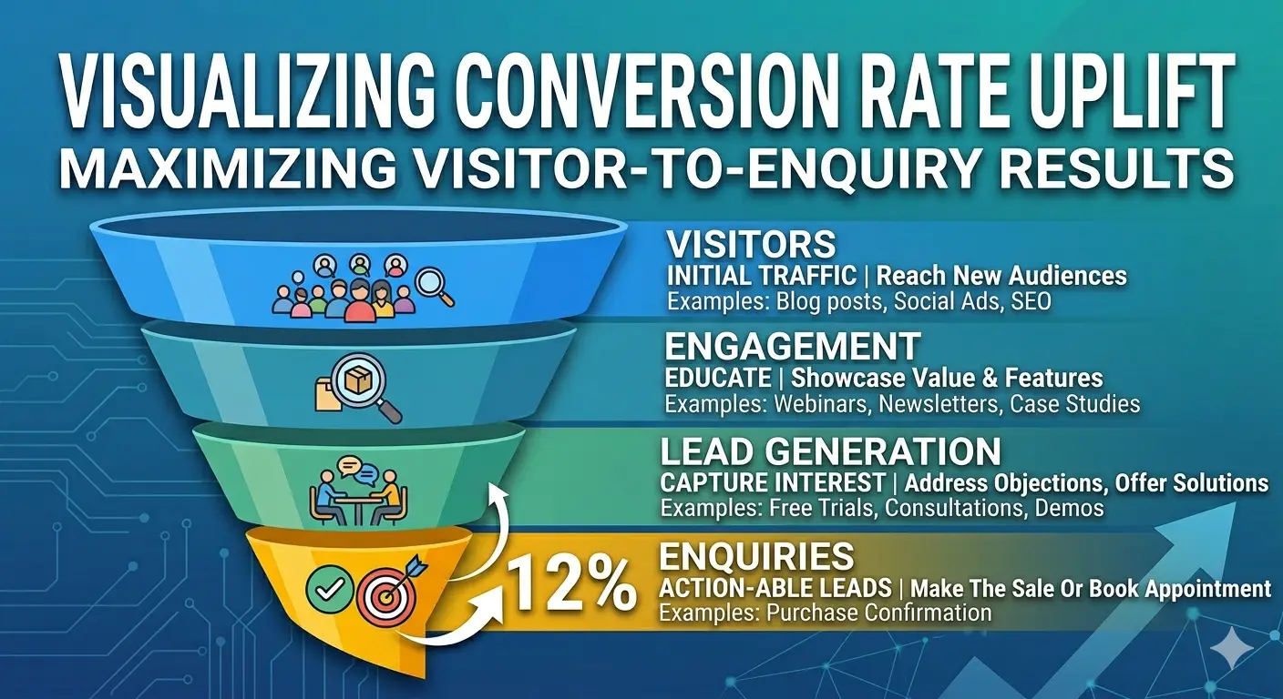
A high-converting website is one that reliably turns a meaningful percentage of its visitors into enquiries, leads, or sales. Not occasionally. Not when the stars align. Consistently, as a function of how it’s built, what it says, and how it guides visitors toward the action you want them to take. Most small business websites don’t do this — not because the businesses behind them aren’t good enough, but because the websites weren’t designed with conversion as a primary objective. This guide explains what high conversion actually means, what the elements are that drive it, and how to honestly assess whether your current website qualifies.
What Does “Converting” Actually Mean?
In website terms, a conversion is any action you want a visitor to take — filling in a contact form, booking a call, downloading a resource, making a purchase, or calling your phone number.
Your conversion rate is the percentage of visitors who take that action. If 200 people visit your website in a month and 4 of them submit an enquiry form, your conversion rate is 2%.
This single number — conversion rate — is arguably the most important metric on your website. It determines how much value your website is actually generating from all the traffic it receives, whether that traffic came from Google, social media, referrals, or paid advertising.
A website with a low conversion rate is wasteful regardless of how much traffic it gets. A website with a high conversion rate generates compounding value from every visitor — paid or organic.
What Is a “Normal” Conversion Rate for a Small Business Website?
Benchmarks vary by industry, service type, and traffic source — but for UK service businesses, these ranges are broadly reliable:
Under 0.5%: Below average. Most visitors are leaving without taking any action. This is typically a sign of fundamental issues — unclear value proposition, no compelling CTA, poor trust signals, or a mismatch between the traffic arriving and what the site offers.
0.5%–2%: Average. The majority of small business websites fall here. Not catastrophically poor, but leaving significant opportunity on the table. Incremental improvements to copy, structure, and trust signals typically produce meaningful gains.
2%–5%: Above average. The site is working well. Visitors understand the offer, trust the business enough to act, and find the process of taking action easy. This is what a professionally designed, conversion-optimised website achieves.
Above 5%: Excellent. Usually associated with highly specific traffic (people who’ve been referred, warm leads arriving from email), a very clear and specific offer, or extensive testing and optimisation over time.
The difference between a 0.5% and a 3% conversion rate sounds small. In practice, it means the difference between 1 and 6 enquiries per month from the same 200 visitors — with identical advertising spend, identical SEO investment, and identical effort.
The 10 Elements That Determine Whether a Website Converts
1. A Clear Value Proposition Above the Fold
“Above the fold” means what visitors see before scrolling — the first screen they encounter when they land on your page. Within five seconds, this section must answer: what do you do, who do you do it for, and why should I care?
If your homepage opens with “Welcome to our website” or a beautiful abstract image with no text, you’ve already lost the majority of visitors. People do not scroll to find out what a business does — they make a snap judgement based on what’s immediately visible. Make every word in that first screen count.
2. One Primary Call to Action
Every page should have one clearly defined action you want the visitor to take. One. Not five options, not a busy navigation bar pointing in eight directions, not a gallery of services with no guidance on what to do next.
For most service businesses, that primary CTA is some variation of “book a call,” “get a quote,” or “contact us.” The button should be visible without scrolling, visually distinct, and specific enough that the visitor knows exactly what they’re agreeing to: “Book a Free 20-Minute Discovery Call” converts better than “Contact Us” because the commitment is defined and the barrier feels lower.
3. Social Proof in the Right Places
Potential clients don’t trust what you say about yourself — they trust what others say about you. This means reviews, testimonials, case studies, and client logos need to appear prominently and early in the page — not only on a dedicated Testimonials page that most visitors never reach.
The most effective placement for social proof is directly adjacent to your primary CTA. If someone is on the verge of clicking “Book a Call,” seeing three genuine client testimonials immediately below that button is the final nudge that converts hesitation into action.
4. Page Speed
Every additional second of page load time costs conversions. A page that takes 5 seconds to load loses a significant portion of its visitors before they’ve seen a single word. On mobile — where most of your visitors are arriving — the standard is even less forgiving.
Go to pagespeed.web.dev and test your site. A mobile score below 70 is actively costing you conversions. Below 50 is an urgent priority.
5. Mobile Optimisation
A responsive website (one that technically adapts to different screen sizes) is not the same as a mobile-optimised website (one that delivers an excellent experience on a phone). Many responsive sites have buttons that are too small to tap, text that requires zooming, forms that are difficult to complete on a touchscreen, and navigation that makes finding information cumbersome.
Test your site on your own phone as a new visitor would experience it. Every moment of friction is a lost conversion.
6. Trust Signals Throughout
Converting a stranger into an enquiry requires overcoming scepticism. Trust signals — visible, credible evidence that your business is real, established, and worth engaging with — reduce that scepticism at every stage of the page.
Effective trust signals include: Google reviews with a live star rating, named testimonials with photos and job titles or company names, recognisable client logos, industry accreditations, years in business, specific results achieved for clients (“47 projects delivered” is more credible than “many happy clients”), and a real address rather than just a contact form.
7. Benefit-Led Copy
Most business website copy describes what the company does. High-converting copy describes what the client gets. These sound similar but produce very different results.
“We are a Wolverhampton-based web design agency offering bespoke website development” describes you.
“We build websites that rank on Google, load fast on every device, and convert visitors into enquiries — so your website becomes a reliable source of new business rather than a digital business card” describes the client’s outcome.
The second version speaks to what the visitor actually wants. Write every page from the visitor’s perspective: not what you do, but what they gain.
8. A Logical User Journey
Your website should guide visitors through a deliberate sequence — from landing, to understanding what you offer, to seeing evidence that you deliver it, to feeling confident enough to take the next step. This sequence should be designed, not left to chance.
Think of it as a path: headline → what we do and who for → evidence we deliver it → what happens when you work with us → one clear action to take next. Every element should serve the journey. Anything that doesn’t belongs on a different page or removed entirely.
9. Lead Capture for Visitors Not Ready to Enquire
Most website visitors — even genuinely interested ones — aren’t ready to enquire on their first visit. A high-converting website captures some of these visitors before they leave, typically by offering something valuable in exchange for their email address.
This could be a free guide, a checklist, a template, or an invitation to a newsletter. The goal is to move from anonymous visitor to known lead — someone you can continue a conversation with rather than hoping they return on their own.
10. A Frictionless Enquiry Process
The moment a potential client decides to contact you is the moment everything you’ve built either pays off or falls apart. A broken form, a phone number that goes straight to voicemail, a booking link that requires creating an account, a confusing multi-step process — any friction at this stage loses conversions that were already won.
Your enquiry process should be: one step, immediately accessible, mobile-friendly, and confirmed with an immediate acknowledgement that their message was received and what happens next.
Does Your Website Qualify? The Self-Assessment
Score your website honestly against each element:
| Element | Not present | Partially done | Done well |
|---|---|---|---|
| Clear value proposition above the fold | 0 | 1 | 2 |
| Single primary CTA visible without scrolling | 0 | 1 | 2 |
| Social proof adjacent to CTA | 0 | 1 | 2 |
| Mobile speed score above 70 | 0 | 1 | 2 |
| Excellent mobile user experience | 0 | 1 | 2 |
| Multiple trust signals visible | 0 | 1 | 2 |
| Benefit-led copy throughout | 0 | 1 | 2 |
| Logical guided user journey | 0 | 1 | 2 |
| Lead capture mechanism | 0 | 1 | 2 |
| Frictionless enquiry process | 0 | 1 | 2 |
Score 16–20: Your website is well-optimised for conversion. Focus on ongoing testing and incremental improvements.
Score 10–15: Meaningful improvements possible without a rebuild. Prioritise the lowest-scoring elements.
Score under 10: Fundamental conversion issues that incremental fixes are unlikely to resolve. A structured rebuild is worth serious consideration.
How to Improve Your Conversion Rate
Some improvements can be made quickly without rebuilding the site: clarifying the headline, making the CTA button more visible, adding testimonials to key pages, fixing broken forms, improving mobile button sizes.
Others require more significant work: restructuring the page layout, rewriting the copy throughout, adding a lead capture mechanism, improving site speed at a technical level.
And some conversion issues are symptoms of a deeper structural problem — a site architecture that fights the user journey, a platform that limits what’s achievable, or a fundamental mismatch between what the traffic expects and what the page delivers. These typically require a rebuild to fix properly.
The most reliable way to improve conversion rate is to measure it properly first (Google Analytics + a goal configured for form submissions), make one change at a time, and measure the impact before making the next change. Conversion rate optimisation done rigorously produces compounding improvements over time.
Frequently Asked Questions
What is a high-converting website? A high-converting website is one that reliably turns a meaningful percentage of its visitors into enquiries, leads, or sales. For UK service businesses, a conversion rate of 2–5% is considered above average. The key elements that drive conversion include a clear value proposition, a single primary call to action, prominent social proof, fast load speeds, excellent mobile experience, benefit-led copy, and a frictionless enquiry process.
What is a good website conversion rate for a small business in the UK? For UK service businesses, a conversion rate of 2–3% is considered good. Above 5% is excellent and usually reflects highly targeted traffic combined with strong conversion optimisation. The average for most small business websites falls between 0.5% and 2%. Even a modest improvement from 1% to 2% doubles the number of enquiries from the same volume of traffic.
How do I find out my website’s conversion rate? Install Google Analytics on your website and configure a goal for your primary conversion action — typically form submission or thank-you page visit. Your conversion rate is then visible in the Conversions section. If you don’t have Analytics installed, you’re measuring nothing — adding it is the essential first step.
Can I improve my website conversion rate without rebuilding it? Some improvements — clarifying the headline, making the CTA more prominent, adding testimonials near the CTA, fixing mobile usability issues — can be made without a rebuild. Significant conversion improvements typically require structural changes to page layout, copy, and user journey design that may be difficult or impossible to achieve within the constraints of a poorly built original site.
What is the most important element of a high-converting website? The value proposition above the fold is typically the highest-leverage single element — it determines whether a visitor stays or leaves within the first five seconds. If visitors don’t immediately understand what you do, who you do it for, and why they should care, all other conversion elements are irrelevant because the majority of visitors will have already left.
How long does it take to improve website conversion rate? Quick wins — headline clarity, CTA visibility, adding social proof — can be implemented in days and may show measurable improvement within weeks. Structural changes take longer to implement and longer to measure meaningfully. As a general rule, allow 30 days after making a change before assessing its impact, to ensure the data reflects normal traffic patterns rather than anomalies.
Final Thought
A high-converting website is not a luxury — it is the foundational asset that determines how much value every other marketing investment delivers. Better SEO means more traffic; a better conversion rate means more of that traffic becomes revenue. Every pound spent on Google Ads, every hour invested in content, every effort put into local SEO returns more when it lands on a website that’s built to convert.
The gap between a 0.5% and a 3% conversion rate is the difference between a website that’s a cost and a website that’s an asset. Most of the elements that drive that gap are knowable, measurable, and fixable.
At HusQuay, conversion is built into every website we design — not bolted on afterwards. If you’re not sure whether your current site qualifies, the self-assessment above is your starting point — or let’s look at it together.
👉 Book a free website conversion review with HusQuay
HusQuay is a digital growth agency helping small businesses across the UK, USA, Australia, and Canada build websites, brands, and digital systems that create measurable results. Based in Wolverhampton, UK.